As shown in the previous post Monitoring Azure Virtual Machines with Log Analytics Part 3: Dashboard, another option to display a form of dashboard is using Log Analytics Custom Views. The collection of views can be found in your log analytics workspace in the Workspace summary blade.
For example, the views shown are a bunch of out-of-the-box solution views and one custom views.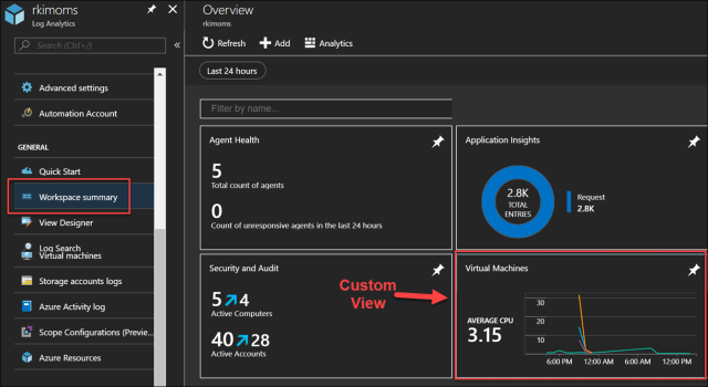
By clicking into my custom view, you can see detailed visualization parts that are backed by log analytics queries. I am showing average CPU, available disk space, available memory and last heartbeat for all running virtual machines bound by the time range filter.

The the first 3 visualization parts I am demonstrating are the Line chart, callout, & lists.

This consists of a line chart with callout, and the top ten results for an aggregated log search query.
For Average CPU visualization, I have configured as follows

- General – Setting Group Title

- Header – Setting Title and sub title of visual

- Line Chart – Good to show historical time series of data values.Perf
| where CounterName == “% Processor Time” and InstanceName == “_Total”
| summarize AggregatedValue = avg(CounterValue) by bin(TimeGenerated, 1h), Computer

- List – To show top 10 query results of Average CPU time of the last hour
Perf
| where CounterName == “% Processor Time” and InstanceName == “_Total”
| summarize AggregatedValue = avg(CounterValue) by Max(TimeGenerated, 1h), Computer
| project Computer, AggregatedValue
Enabled Thresholds shows green, yellow or red dots beside the Computer name to indicate threshold.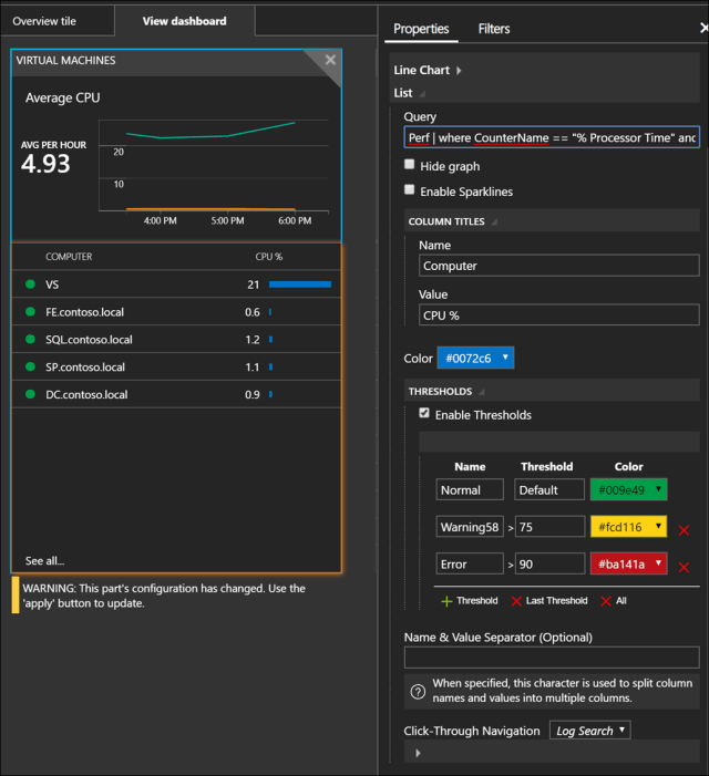
For my configuration and queries for the Available Disk visualization.

For brevity, I’ll just show the queries applied. The configuration approach is the same as previous.
- Line Chart
Perf
| where ObjectName == “LogicalDisk” and CounterName == “Free Megabytes” and InstanceName != “_Total”
| summarize min(CounterValue) by bin(TimeGenerated, 1h), Computer, InstanceName
- List
Perf
| where ObjectName == “LogicalDisk” and CounterName == “Free Megabytes” and InstanceName != “_Total”
| summarize arg_max(TimeGenerated, *) by Computer, InstanceName
| summarize FreeDisk_MB = min(CounterValue) by Computer, InstanceName
Side note: Kudos to fellow MVP Stanislav Zhelyazkov (@StanZhelyazkov , cloudadministrator.net) for helping me out with the previous and next list query as it was a cleaner approach than what I had before.

For Available Memory visualization, the configuration is the same approach as the previous Available Disk visualization part. The queries used are
- Line chart
Perf
| where ObjectName == “Memory” and CounterName == “Available MBytes”
| summarize AvailableMB=min(CounterValue) by bin (TimeGenerated, 1h), Computer
| order by Computer nulls last
- List
Perf
| where ObjectName == “Memory” and CounterName == “Available MBytes”
| summarize arg_max(TimeGenerated, *) by Computer, InstanceName
| summarize Available_MB = min(CounterValue) by Computer
For the last visualization part on VM last heartbeats, the queries used are
- Chart
Heartbeat | summarize LastCall = max(TimeGenerated) by Computer
- List
Heartbeat | summarize LastCall = max(TimeGenerated) by Computer
Final Remarks
Log Analytics custom views provides more sophisticated options for visualizations than what is offered through the Log Analytics query results pane render chart. Such as spark lines, thresholds, filtering and click through navigation. For further details on these, read Reference guide to View Designer visualization parts in Log Analytics.
For those starting out, I would recommend creating a dashboard by pinning Log Analytics query results and charts onto Azure Portal’s Dashboard as this is easier to setup, manage and more intuitive. As your needs and requirements evolve and are supported by Log Analytics custom views, then start to consider the custom view and its visualization parts.
References
